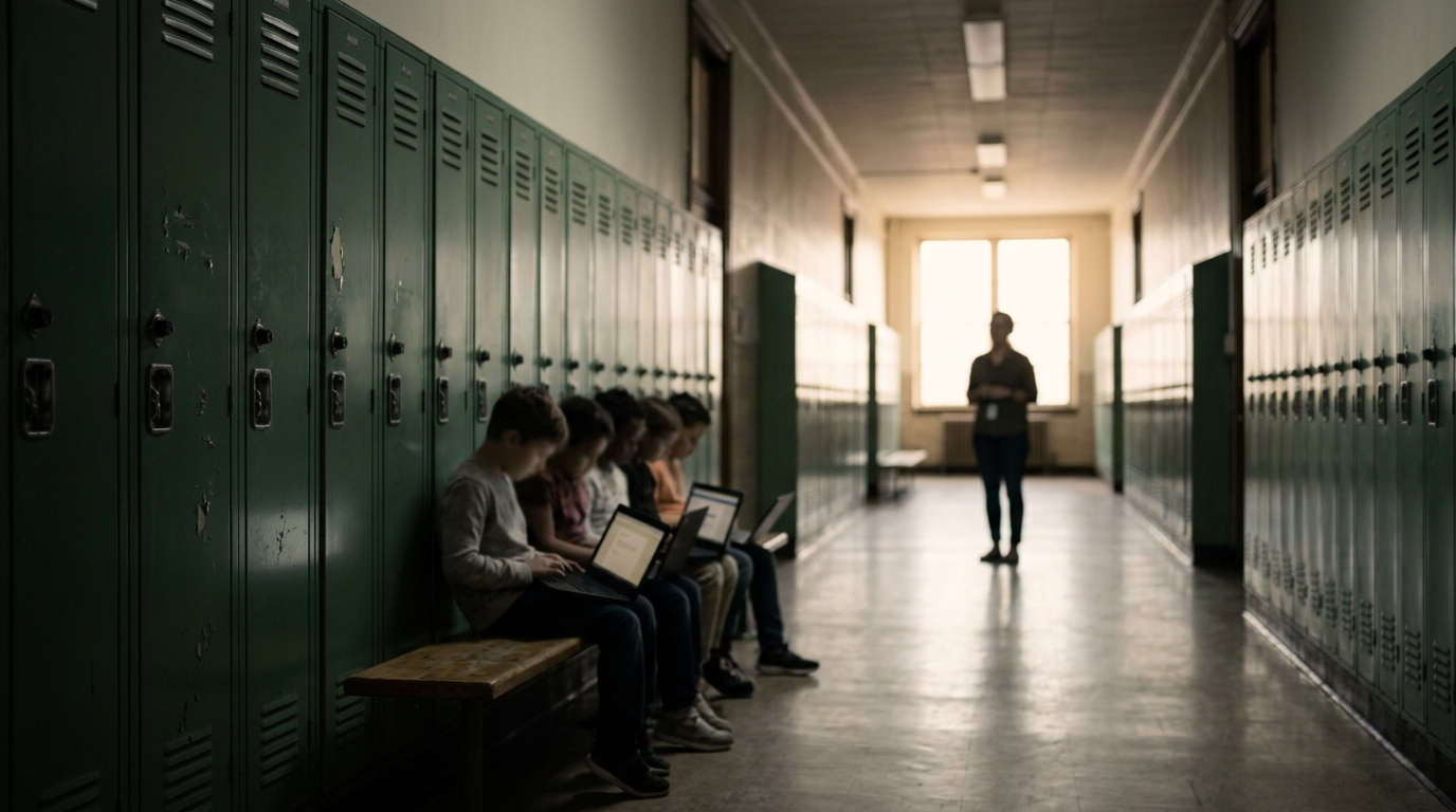

At 8:05, an assignment opens instantly on the teacher’s laptop. On the oldest Chromebook in the cart, the same page produces a gray spinner, then a frozen drag-and-drop widget. By the time it responds, the student has spent more attention managing the device than examining the evidence.
The machine has done nothing wrong. It has exposed a design choice.
That is the central problem in Chromebook education. Richness is often measured in media: video, animated diagrams, live widgets, and multiple tabs. For low-end device learning, richness should be measured in what the student must notice, decide, explain, and revise. A lean interface can carry a demanding lesson. A heavy one can leave very little room for thought.
Access is a condition, not an outcome
The most useful warning comes from a program much larger than any school’s Chromebook cart.
In a randomized evaluation of Peru’s One Laptop per Child program, Julián Cristia, Pablo Ibarrarán, Santiago Cueto, Ana Santiago, and Eugenio Severín studied 319 rural schools. After roughly 15 months, students used computers more often and showed stronger computer proficiency. The researchers found no detectable gains in enrollment, attendance, or measured academic and cognitive outcomes.
That result does not show that laptops are useless. It shows that a device rollout can meet its immediate operational goal without changing the learning task. If students receive a computer but still encounter confusing instructions, weak feedback, or content that assumes a fast connection, possession alone will not repair the lesson.
Mark Warschauer’s 2003 book, Technology and Social Inclusion, offers a useful way to read that finding. Access involves physical resources such as devices and connectivity, digital resources such as worthwhile content, human resources such as skills, and social resources such as support from teachers and institutions. A student with a working Chromebook but no clear way to recover from a failed upload has access in one sense and not another.
Use that broader definition for a quick audit:
| Access layer | Ask | Repair this week |
|---|---|---|
| Hardware | Can the oldest supported Chromebook open the core page with one tab? | Remove autoplay, heavy embeds, and unnecessary scripts. |
| Connection | Does essential content appear before optional media? | Put instructions and data first; make media optional. |
| Interface | Can students complete the task with a keyboard and simple controls? | Replace drag-only actions with keyboard-accessible choices or typed responses. |
| Support | What happens after a timeout or failed upload? | Provide a clear retry, local copy, or teacher-managed alternative. |
This is a more useful device audit than asking whether a school has one computer per student.
A slow page can become part of the cognitive load
Working memory has no special exemption for technical friction.
The classic cognitive load framework developed by John Sweller and later extended by Jeroen van Merriënboer and Fred Paas distinguishes between the complexity of the subject itself and the extra mental effort caused by poor presentation. A learner should spend effort reasoning about a historical source or interpreting a graph. They should not spend that effort guessing whether a button registered, remembering where a control moved after scrolling, or deciding whether a page has stopped loading.
Cognitive load theory was not developed as a study of Chromebooks, so this is an application of the framework rather than a Chromebook-specific finding. A two-second delay does not automatically damage learning. The problem appears when technical uncertainty forces students to hold the learning task in mind while also troubleshooting the interface.
That distinction changes what a teacher removes.
Take a grade 7 science activity on heat transfer. A four-minute video, a moving simulation, and a drag-and-drop labeling exercise may look richer than a static page with a diagram, six measurements, and a claim-evidence-reasoning prompt. If the target is to infer a relationship from data, the static version may require more useful thinking. The video can remain as an optional demonstration, but it should not carry the only instructions or the only evidence students need.
During planning, label every element as target content, a learning cue, or a convenience. Keep the first two in the core path. Remove convenience from that path. Replace a moving cue with a heading, arrow, caption, or short sentence. Keep one primary action visible rather than asking a low-powered device to render several competing interactions at once.
The counterintuitive point is worth keeping: fewer interactions can produce more active cognition when the cost of interaction is high.
Build the core path before the polished path
Write the lesson’s core path before adding its visual polish:
Learning target → material → learner action → evidence
Each part should survive on the oldest device your IT department still supports, with one browser tab open and no required video. The core path is not a watered-down version of the lesson. It is the part that carries the intellectual standard.
For a source-analysis task, that might mean two short primary-source excerpts, dates and authors, one comparison prompt, and a written claim supported by evidence. A zoomable scan, highlighting tool, or optional audio version may improve the experience. None should be the only way to understand the sources or submit the reasoning.
The same principle applies to web-based education more broadly: the browser is a delivery mechanism, not the learning plan. Build a dependable base, then add enhancements that fail gracefully. If a video does not load, the student should still be able to see the data. If a drag-and-drop widget fails, the student should still be able to make the same classification through a keyboard-accessible choice or typed response.
Run this short test before assigning the lesson:
- Open it on the oldest available Chromebook, not the teacher’s newer laptop.
- Time the interval from opening the page to the first meaningful student action.
- Reload midway through the task and check whether the instructions and work survive.
- Block the optional media and see whether the core reasoning remains possible.
- Complete the task with a keyboard only, then check the contrast, text size, labels, and focus order.
If no older device is available, ask school IT for a test unit or use browser network throttling with help from someone comfortable with developer tools. This is not a performance benchmark. It is a way to find the point where a technical inconvenience becomes a learning barrier.
Do not confuse lightness with accessibility. A page with tiny text, unlabeled controls, or poor keyboard support is not a lean lesson. It is a lesson that has shifted its costs onto students who already face the most friction.
Keep the learning rich when the interface is lean
Some learning goals genuinely need sound, movement, or simulation. Pronunciation, a lab procedure, a changing weather system, and a visual arts technique can lose important meaning when reduced to paragraphs.
The answer is not to strip every lesson down to text. Keep the medium when it carries essential content, but give it a clear job. A short captioned clip can demonstrate a process. A transcript can support review and reduce bandwidth dependence. A static diagram can preserve the relationship students need to inspect. A live simulation can be useful when students must change variables and observe a system, but it should not also carry the lesson directions, glossary, and assessment controls if the device is already struggling.
Put complexity into the learner’s response rather than the page’s decoration. Ask students to compare two cases, explain a pattern, annotate a still image, rank evidence, or revise an initial claim. Those actions can produce rich evidence of understanding without requiring a large number of animated objects.
There is a practical privacy benefit as well. A stable page with fewer embedded services usually requires fewer permissions, fewer third-party handoffs, and fewer points of failure. That is not the main reason to simplify a lesson, but it is a welcome side effect.
Teachers also should not create a completely separate lesson for every device. Build one durable core and add optional routes for audio, video, visual exploration, or advanced interaction. The learning target stays consistent while the delivery becomes more forgiving.
Where this advice fails—and a 30-minute test
This advice fails when low-end becomes a polite excuse for low expectations.
A lighter page cannot solve a missing home connection, a dead battery, or a student who has no quiet place to work. It also cannot replace a modality that a student genuinely needs. Captions and transcripts are valuable, but a transcript does not reproduce every feature of a spoken language model, and a paragraph is not an equivalent substitute for every laboratory demonstration. Some students will need the richer medium, an offline resource, or direct teacher support.
The evidence has limits, too. There is strong research on access, digital inclusion, and cognitive load, but much less direct causal evidence connecting the weight of a particular webpage or the age of a particular Chromebook to test scores. The recommendations here combine the Peru evaluation, Warschauer’s access framework, cognitive load theory, and practical web design. They are not a magic specification for every classroom.
A useful first test takes about 30 minutes:
- Choose one lesson that currently depends on a large page, video, drag-and-drop interaction, or several open tabs.
- Write the learning target and the evidence that would prove it.
- Create a core path with the necessary content, one primary action, and one way to show the reasoning.
- Test that path on the oldest supported device under an ordinary school connection.
- Compare the student work with the original lesson. Keep an enhancement only if it improves understanding, access, or feedback.
Do not judge the replacement by how modern it looks. Judge whether students can reach the same intellectual work with less technical interference. Start with the page that makes the oldest Chromebook spin, and make the first meaningful action belong to the learner.